
ANIME WEEKEND ATLANTA kind of, let's say, congealed out of a longrunning anime club and several intersecting groups of friends and fans all of whom swore a solemn oath that if anybody was gonna start an anime convention in Atlanta, it was gonna be THEM. Back in the mid 1990s anime cons were popping up everywhere like magic; A-Kon in Dallas, Anime America in the Bay Area, Anime East in Jersey; and in Atlanta we knew that if we didn't get our act together - and fast - some total loser would rent a hotel ballroom, sell some dealers tables, and we'd find ourselves on the wrong side of the staff badge. Which is not a good place to be.
In Atlanta fourteen or fifteen years ago THE place to have your first-year convention was the Castlegate Hotel , and that's where we went for our first show. With a few hundred dollars for deposit, the place was ours. Dank hallways, a slothful and possibly larcenous staff, and mysterious double-booked rooms didn't stop us from launching our anime con with a successful first year. But convention reminisces are a dime a dozen, what we're talking about here is reminiscing about anime con program books. Specifically, AWA's program books!
Our first program book was printed off the clock in an undisclosed location and assembled by myself and a crew of bindery novices using a balky folder and a giant foot-operated stitcher. From the start, we figured an anime-themed convention would only attract a few hundred goofballs such as ourselves, and so we could pretty much be as creative as we liked with the program book. Hence, our first year theme of "activity book" - the book included a crossword puzzle and a coloring page.

AWA 2 was held in a newer, yet more ineptly staffed facility down by the airport. Our program book continued the legal-size-folded-booklet format and the cover illustration was a photograph of AWA staffers and guests posing imposingly in front of Marietta Georgia landmark The Big Chicken, which came to be a de facto mascot for the convention, if only for its kitsch value. The visual motif was fakey ragtime-era gingerbread, with the now-usual additions of David Letterman-inspired Top Ten lists. From the start AWA's program books have always featured useful things like maps of the local area's restaurants and shops, listings for clubs and sites for post-convention contact, and a full schedule of the entire convention. A lot of other conventions don't include schedules in their program books, leaving that vital information to be dissimenated via "pocket programs" and other doubtful methods. Well, we say, if you don't put the con schedule in the program book, why have a program book in the first place?

AWA 3 moved to the Marriott North Central and the program book, still in the legal booklet size, took Communist Propaganda as its design guideline and writing style manual. The cover imagery came from the dust jacket of the Red Chinese opera "Taking Tiger Mountain By Strategy", with of course a giant Big Chicken looming in the background, and the text was full of righteous indignation of the worker's proletariat towards the grasping paper-tiger claws of capitalist exploitation.

AWA 4 took the convention's success (over 1200 attendees that year) and a higher printing budget and produced what many feel is the best looking convention program book ever. Printed as a comic book, it featured a glossy cover and newsprint interior, professionally bound to resemble your typical issue of X-Men or Superman. Highlights included a fake Jack Kirby cover and fake mail-order ads in the interior. I've seen this book bagged and boarded for sale in comic shops. Go figure.

AWA 5's book was our first magazine-sized program guide, with a glossy color cover that totally destroyed the color copier where I happened to be working at the time, and black and white insides courtesy the Xerox Docutech! Theme this time was a fake Japanese cartoon based on the Big Chicken starring thinly disguised caricatures of AWA staff and guests. The con itself was held way way out in the suburbs in a hotel that was painfully too small for us. Growing pains!

AWA 6 took place at a classy hotel near a classy mall in a classy suburb a lot closer to downtown Atlanta. Hell, you could actually get to this one on public transportation! So naturally our progam book theme was punk rock. We put the cover on upside down, pasted all the text down with gluestick, made corrections with Sharpies, used found photos and drug-reference cartoons, and generally tried to imitate the D.I.Y. samizdat punk zines of our youth. As an artistic statement the program book was a tremendous success, but as a convention program book it confused and horrified its intended audience. Which was what we intended all along! Size was an 8.5 x 11 booklet, favored by small press comics creators the world over.

AWA 7 saw the convention move to a giant convention center down by the airport, and visually the convention took its cue from airline logos of the 1960s, the golden age of air travel. A modified TWA logo was the centerpiece and as nobody's sued us over it yet, I guess we got away with it. Since AWA 7 was held two weeks after the attacks of 9/11/01, I figure everybody had other things on their minds.

AWA 8 - again at the convention center down by the airport - taxed the skill of its contributing artists to the max as we asked them to work in themes as divergent as auto racing and Art Nouveau. The resulting cover is a classic, and the book - a magazine-sized book with a severe vertical trim - is one of my favorites. Guest bios were accompanied by 19th century woodcuts of bearded men or crinolined women, resulting in delicious confusion.

AWA 9 saw a dramatic move to AWA's current digs at the Waverly/Cobb Galleria Convention Center. And what design motif could say "Cobb County" better than that of a children's encyclopedia from the 1950s? Don't answer that. At any rate, some swell photo-manipulation and deadpan new descriptions for old screentoned photos turned the book into a learning experience for the entire convention.

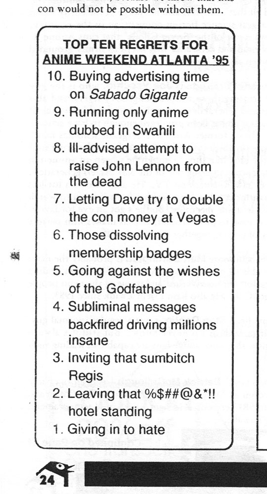
AWA 10's visual theme was "traditional Japanese art", which meant lots of woodblock prints of geishas and a giant ideogram for "10" on the cover. Also the last of the Top Ten lists! It's fascinating to see the difference in the content as the years go by - ads for local comic shops and the upcoming gaming cons are replaced with professional full color ads for new DVD releases, on-demand anime channels, and shared-user online computer games. Some of which are even still in business!

When AWA 11 rolled around the staff got together and decided the theme they wanted was "giant monsters". CB Smith outdid himself with a fantastic manipulated cover based on the poster for "Godzilla VS The Thing" . Unfortunately, when the book went to press, the shop decided that OBVIOUSLY the photo of the Japanese woman was the REAL cover, and the fake Godzilla poster was not. So they put all the covers on inside-out. This printing company is no longer in business. Coincidence? I think not.

AWA 12's book reflected the new respectability of Japanese animation in the United States as well as the sophistication and maturity of a community that had moved from Pokemon to Card Captors to Gundam Wing to Full Metal Alchemist. The book was our first all-color, all-glossy magazine, inerringly designed to mimic a modern woman's fashion magazine. Fake horoscopes abutted fake ads for makeup and womens wear as fake advice columns dispensed fake advice. Maybe a little too contrived, but what other convention was willing to go this far for a gag? None of them, that's who.

The program book for AWA 13 was kind of a last minute rush job, and yet you would never know it, because it looks great. Gothic Lolita was the theme and from the swell cover (yes, I'm describing an illustration of some clown-makeup-smeared Gloom Cookie as "swell") to the elegant layout it was a book that gets the job done in the finest AWA tradition. Well, maybe not quite as goofy as previous. But there's always next year!
Staffing a convention is hard work, but one of the things I always enjoy is sitting down and writing copy for the program book. We always took a less-than-serious attitude towards, well, everything, and I think our cheeky and subversive style made the program guides fun to read as well as useful. Will this trend continue towards the future? There's only one way to find out - visit Anime Weekend Atlanta!
AWA 14 is happening September 19-21 at the Cobb Galleria Center / Waverly Hotel in Atlanta GA! Find out more here!!
-Dave Merrill
(artwork and layout for various AWA program books by Joe Vecchio, CB Smith, Bryan Thompson, Robert DeJesus, Bruce Lewis, Sho Murase, Lewis Cox III, Steve Harrison, myself.)
Thanks for reading Let's Anime! If you enjoyed it and want to show your appreciation for what we do here as part of the Mister Kitty Dot Net world, please consider joining our Patreon!
3 comments:
The program guide for AWA6 is still my all time favorite for any con any where.
Nice article. It's great to see all the old program books again. I must say I miss the top ten lists.
Which I also must comment on. Isn't one list missing? I recall there being one titled "Top Ten Things Most Overheard in AWA Staff Meetings" Or something like that. With two of the items on the list being:
'Ok after we get them all in the Dealer's Room, we release the poison gas!'
and my favorite (and why I recall this missing list)
'Must Make Sandwhich!'
Wow, you brought back some good memories there! That first one is classic... Ozone Commandos style! Man, I miss those days...
Post a Comment